|
|
Joined: Sep 2001
Posts: 25,011 Likes: 31
brutally Kamphausened 15000+ posts
|
OP

brutally Kamphausened 15000+ posts
Joined: Sep 2001
Posts: 25,011 Likes: 31 |
I got the idea to post this topic from this site I came across online: Which displays quite a few photo-collage covers. The first photo-collages I saw in comics were by Jack Kirby, in the classic Lee/Kirby FF run. Although I know the practice goes all the way back to the 1940's. I've seen them used by artists as diverse as C.C. Beck, Neal Adams, Jack Kirby, Mike Grell, John Byrne, Steve Bissette/John Tottleben, and many others. Usually done for a sense of realism. But particularly in horror stories, they can create realism mixed with a creepy sense of the supernatural.  [Click any image to enlarge ] [Click any image to enlarge ] The ones on romance comics, particularly from the 50's, just present very sexy and enticing images of women. No doubt they helped sales ! Others just create a really wild visual effect. I'm thinking in particular of a Bissette/Tottleben "Dracula" story in BIZZARE ADVENTURES 33, from 1982. THe cover of that is of Dennis O'Neil and a female Marvel staffer. 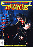 I especially get a kick out of what are termed "infinite" covers in the Overstreet Guide.  Here's one of my favorites from 1975 issue of SUPERMAN : 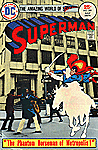 Anyone else have some cool favorites they'd like to mention?
|
|
|
|
|
Joined: May 2003
Posts: 648
500+ posts
|
|
500+ posts
Joined: May 2003
Posts: 648 |
One of my first comics... Action Comics 419 
|
|
|
|
|
Joined: Sep 2001
Posts: 25,011 Likes: 31
brutally Kamphausened 15000+ posts
|
|
OP
brutally Kamphausened 15000+ posts
Joined: Sep 2001
Posts: 25,011 Likes: 31 |
 ACTION 419, that's a nice one Casselmm. And an interesting art combo, too. Neal Adams Pencils, inked by Murphy Anderson. A lot of these cityscapes are of New York City, no doubt because Marvel and DC are in New York City, as are a majority of artists and writers who work in the comics field. I also like this SUPERMAN 263 cover, from the same period as the ACTION 419 cover: 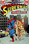 And it has the same art team, Neal Adams pencils, Murphy Anderson inks, along with a background photo of the streets of New York. I also like this KA-ZAR cover, issue 26, Ron Frenz/Armando Gil art, also utilizing a photo-background. Although this is a wrap-around cover, so you can't see the whole thing. 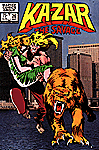
|
|
|
|
|
Joined: Mar 2004
Posts: 17,853 Likes: 3
Son of Anarchist 15000+ posts
|

Son of Anarchist 15000+ posts
Joined: Mar 2004
Posts: 17,853 Likes: 3 |
hah! fucking supes should wipe that smile off his face!
|
|
|
|
|
Joined: Sep 2001
Posts: 25,011 Likes: 31
brutally Kamphausened 15000+ posts
|
|
OP
brutally Kamphausened 15000+ posts
Joined: Sep 2001
Posts: 25,011 Likes: 31 |
Here's a few offerings from 50's and 60's romance comics that I thought were pretty fun. Here's issues 2 and 6 of COWBOY LOVE: 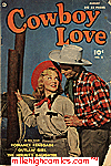 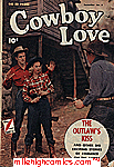 TEN STORY LOVE (1954):  And: 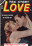 Plus two steamy covers from LOVERS LANE and LOVE CONFESSIONS: 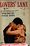 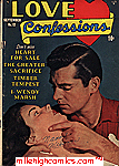
|
|
|
|
|
Joined: Mar 2004
Posts: 17,853 Likes: 3
Son of Anarchist 15000+ posts
|
|
Son of Anarchist 15000+ posts
Joined: Mar 2004
Posts: 17,853 Likes: 3 |
I am wisened in the ways of Cowboy Love
|
|
|
|
|
Joined: Sep 2001
Posts: 25,011 Likes: 31
brutally Kamphausened 15000+ posts
|
|
OP
brutally Kamphausened 15000+ posts
Joined: Sep 2001
Posts: 25,011 Likes: 31 |
Well, now, slap leather, ain't you the lucky one !
|
|
|
|
|
Joined: Nov 2000
Posts: 13,392
[insert non-dated reference here] 10000+ posts
|
|
[insert non-dated reference here] 10000+ posts
Joined: Nov 2000
Posts: 13,392 |
Dial B for Blog should really get an RSS feed. Makes things simpler to keep up with.
|
|
|
|
|
Joined: Sep 2001
Posts: 25,011 Likes: 31
brutally Kamphausened 15000+ posts
|
|
OP
brutally Kamphausened 15000+ posts
Joined: Sep 2001
Posts: 25,011 Likes: 31 |
I followed r3x29yz4a's link to the superdickery website, and couldn't resist posting this photo-cover:  THE RIFLEMAN # 10 (1963) THE RIFLEMAN # 10 (1963)Just a little bit... suggestive...
|
|
|
|
|
Joined: Nov 2000
Posts: 13,392
[insert non-dated reference here] 10000+ posts
|
|
[insert non-dated reference here] 10000+ posts
Joined: Nov 2000
Posts: 13,392 |
Yeah, I've seen that one a few times. It's a classic.
|
|
|
|
|
Joined: Nov 2000
Posts: 4,069
Public Enemy #4 4000+ posts
|
|
Public Enemy #4 4000+ posts
Joined: Nov 2000
Posts: 4,069 |
Quote:
casselmm47 said:
One of my first comics... Action Comics 419
I think this might have been the first comic I ever read...I know that I used to own it. If it wasn't this one, then it was another with the same type of cover that came out the same year. Was it '74 or 75...?
Oderint, dum metuant.
You are a god damned idiot, you know that? You ought to be smacked upside your dumb-fuck head, even after all these years. Shame on you! -USCHI showin' some love
|
|
|
|
|
Joined: Sep 2001
Posts: 25,011 Likes: 31
brutally Kamphausened 15000+ posts
|
|
OP
brutally Kamphausened 15000+ posts
Joined: Sep 2001
Posts: 25,011 Likes: 31 |
That particular ACTION COMICS 419 one, T B, is from December 1972. https://www.milehighcomics.com/cgi-bin/backissue.cgi?action=fullsize&issue=01052011824%20419The only other two early/mid-70's Superman photocollage covers I know of are shown above, from SUPERMAN 263 (April 1973), and SUPERMAN 289 (July 1975). The latter is a favorite of mine for several reasons. It has several DC staffers in the photo, including Cary Bates and Elliot Maggin. And it has one of the most bizarre ads I've ever seen in a comic book. It's a full-page ad showing an uneasy-looking housewife standing in her kitchen. And solicits you to purchase their home study course to get your high school diploma, asking the reader: "Are your children ASHAMED because you never graduated high school?" It's about the cruelest ad I've ever seen. Shaming people into buying their product. It only ran the one time, in all the DC comics that month.
|
|
|
|
|
Joined: May 2003
Posts: 43,951 Likes: 6
Officially "too old for this shit" 15000+ posts
|
|
Officially "too old for this shit" 15000+ posts
Joined: May 2003
Posts: 43,951 Likes: 6 |
Quote:
Wonder Boy said:
I'm thinking in particular of a Bissette/Tottleben "Dracula" story in BIZZARE ADVENTURES 33, from 1982. THe cover of that is of Dennis O'Neil and a female Marvel staffer.

That's Denny O'Neill? Are you sure? I've met the man (including once in the mid 80s) and he looked nothing like that.
|
|
|
|
|
Joined: Oct 2000
Posts: 53,734
Educator to comprehension impaired (JLA, that is you) 50000+ posts
|
|
Educator to comprehension impaired (JLA, that is you) 50000+ posts
Joined: Oct 2000
Posts: 53,734 |
maybe he looks different with clothes on?
|
|
|
|
|
Joined: Nov 2000
Posts: 4,069
Public Enemy #4 4000+ posts
|
|
Public Enemy #4 4000+ posts
Joined: Nov 2000
Posts: 4,069 |
Oderint, dum metuant.
You are a god damned idiot, you know that? You ought to be smacked upside your dumb-fuck head, even after all these years. Shame on you! -USCHI showin' some love
|
|
|
|
|
Joined: Sep 2001
Posts: 25,011 Likes: 31
brutally Kamphausened 15000+ posts
|
|
OP
brutally Kamphausened 15000+ posts
Joined: Sep 2001
Posts: 25,011 Likes: 31 |
the G-man said:Wonder Boy said: I'm thinking in particular of a Bissette/Tottleben "Dracula" story in BIZZARE ADVENTURES 33, from 1982. THe cover of that is of Dennis O'Neil and a female Marvel staffer. That's Denny O'Neill? Are you sure? I've met the man (including once in the mid 80s) and he looked nothing like that. Well, O'Neil jokes in the issue's editorial about how people should be afraid of him because he was present when the picture was taken. It could be an ambiguous way of saying he was in the background off-camera when it was shot. But he seems to jokingly be saying he's the vampire in the picture, and that he's not human. The "Dracula" story by Perry/Bissette/Tottleben is a great story, and very Halloween atmospheric. It also is the first Bissette/Tottleben collaboration, that precedes their work together with Alan Moore on SWAMP THING, by about a year, with some really eerie visual effects using photo-collage in the story. Exceptionally well-written also. On a par with Alan Moore, and one of my favorites.
|
|
|
|
|
Joined: Oct 2001
Posts: 47,810 Likes: 2
Hip To Be Square 15000+ posts
|
|
Hip To Be Square 15000+ posts
Joined: Oct 2001
Posts: 47,810 Likes: 2 |
Can somebody summarise this thread for me cause I really cannot be arsed reading a single post in it!
|
|
|
|
|
Joined: Sep 2001
Posts: 25,011 Likes: 31
brutally Kamphausened 15000+ posts
|
|
OP
brutally Kamphausened 15000+ posts
Joined: Sep 2001
Posts: 25,011 Likes: 31 |
It's about photo-collage art and covers in comics.
I guess that wasn't clear enough in the topic title.
|
|
|
|
|
Joined: Sep 2001
Posts: 25,011 Likes: 31
brutally Kamphausened 15000+ posts
|
|
OP
brutally Kamphausened 15000+ posts
Joined: Sep 2001
Posts: 25,011 Likes: 31 |
That RIFLEMAN photo-cover never gets old! Hilarious.
|
|
|
|
|
Joined: Sep 2001
Posts: 25,011 Likes: 31
brutally Kamphausened 15000+ posts
|
|
OP
brutally Kamphausened 15000+ posts
Joined: Sep 2001
Posts: 25,011 Likes: 31 |
 KAMANDI 9, pages 2 and 3 KAMANDI 9, pages 2 and 3 (oversize image) The double-page splash from KAMANDI 9, Sept 1973. But more clear in this photo than the printed version, and without the art of Kamandi and Ben Boxer superimposed in the foreground. It's interesting to see the art alone without the Kirby art figures added. This was a great panorama photo-spread intended to show "Tracking Site", the moon-like surface of South America in Kamandi's future, destroyed by a meteor shower, and Tracking Site is an astronaut base built in the shape of a sphere that floats above the continent. Plus a defensive satelite to protect the sphere from mutant bats in the middle background. One of Kirby's more successful collages, in portraying impressive visuals in the story. 
|
|
|
|
|
Joined: Sep 2001
Posts: 25,011 Likes: 31
brutally Kamphausened 15000+ posts
|
|
OP
brutally Kamphausened 15000+ posts
Joined: Sep 2001
Posts: 25,011 Likes: 31 |
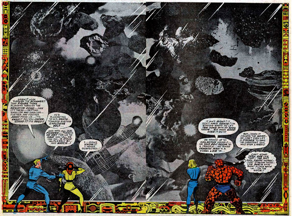 One of the absolute coolest, this double-page spread, pages 2 and 3, of FANTASTIC FOUR 62, May 1967. Reed Richards is in the Negative Zone, and the FF are watching him on a giant monitor screen in the other dimension. In an era when flatscreen technology and giant monitor screens didn't exist, this was especially powerful. I love the photo-collage combined with a surrounding border of Kirby machinery. One I have enlarged to original art size, matted and framed in my "home comic art museum". I was inspired to do this after seeing the original displayed in an Erie Art Museum art exhibit that toured the country in my area in the summer of 1982. Along with original pages from Kaluta (DETECTIVE 427 cover), pages 2 and 3 of Steranko's NICK FURY, AGENT OF SHIELD 3, title page of "Dark Moon Rise, Hell Hound Kill", the gigantic original colored 7 pages of Wrightson's "The Muck Monster" from EERIE 68, plus a lot of Wood, Williamson and Kurtzman EC pages. While not originals, I wanted to emulate the impressive display they were given, for the ones that impacted me most.
|
|
|
|
|
Joined: Sep 2001
Posts: 25,011 Likes: 31
brutally Kamphausened 15000+ posts
|
|
OP
brutally Kamphausened 15000+ posts
Joined: Sep 2001
Posts: 25,011 Likes: 31 |
. ![[Linked Image from storage.googleapis.com]](https://storage.googleapis.com/hipcomic/p/c039da2601cedf7edb3e07f500527122-800.jpg) FROM BEYOND THE UNKNOWN FROM BEYOND THE UNKNOWN issue 22, May 1973. The art portion is by Murphy Anderson, added to a photo by Jack Adler. A really impressive and fun image. https://viewcomiconline.com/from-beyond-the-unknown-issue-22/This series might be to some be a mundane S-F reprint book of DC material from the 1950's and early 1960's, but I thought it had a number of striking covers, and I loved a lot of the reprinted stories by Carmine Infantino, Murphy Anderson and others. It had a very S-F pulp digest feel to it, particularly the covers. Two of the covers are by Michael Kaluta, another is Gray Morrow with Neal Adams inks. Many others by Kubert, Anderson and others doing beautiful work. But this was the series' only photo-collage cover. I thought DC's titles had exceptional coloring in the 1970-1974 period, and I read in one article that Jack Adler did much of the coloring for DC's books in that era. Jack Adler won an A.C.B A. award one year for his work on DC's line.
|
|
|
|
|
Joined: Sep 2001
Posts: 25,011 Likes: 31
brutally Kamphausened 15000+ posts
|
|
OP
brutally Kamphausened 15000+ posts
Joined: Sep 2001
Posts: 25,011 Likes: 31 |
. ![[Linked Image from milehighcomics.com]](http://www.milehighcomics.com/istore/images/fullsize/30663729872.33.jpg) https://viewcomiconline.com/fantastic-four-1961-issue-33/ https://viewcomiconline.com/fantastic-four-1961-issue-33/One of the pioneers of photo-collage in comic art, Jack Kirby did quite a bit of it across Marvel titles from 1964-1966, as this cover from FANTASTIC FOUR 33 (Dec 1964) demonstrates. As you can see in the full story I linked, the page 8 splash page is also a photo-collage. Photo-collage pages by Kirby also appear in issues 29, 32, 37, 39, 48, 51, 55 and the above shown double-page spread in 62, to name just a few.
|
|
|
|
|
Joined: Sep 2001
Posts: 25,011 Likes: 31
brutally Kamphausened 15000+ posts
|
|
OP
brutally Kamphausened 15000+ posts
Joined: Sep 2001
Posts: 25,011 Likes: 31 |
. ![[Linked Image from djfood.org]](https://www.djfood.org/wp-content/uploads/2014/03/Kirby-FF-2.jpg) Pages 6 and 7, from FANTASTIC FOUR ANNUAL 6, from 1968. https://viewcomiconline.com/fantastic-four-1961-annual-6/And here are several other Kirby double-page photo-collage pages : https://www.djfood.org/170-jack-kirby-double-page-spreads/The first two are obviously from THOR issues, circa 1965-1968, I can clarify which issues later, or I'll let someone else answer that. The third is the above one from FF ANNUAL 6. The 4th is from FF 62, posted a few posts above (but here's a link to the full story). The 5th is from JIMMY OLSEN 141, Sept 1971. The 6th is from JIMMY OLSEN 137, April 1971. The 7th and last is from Kirby's HUNGER DOGS graphic novel, in 1985.
|
|
|
|
|
Joined: Sep 2001
Posts: 25,011 Likes: 31
brutally Kamphausened 15000+ posts
|
|
OP
brutally Kamphausened 15000+ posts
Joined: Sep 2001
Posts: 25,011 Likes: 31 |
. ![[Linked Image from i.pinimg.com]](https://i.pinimg.com/originals/4a/52/72/4a52729255f3905c6cb353e69fb70e34.jpg) Neal Adams wasn't a big photo-collage guy. But this one photo-background he added to just one panel in BATMAN 251 really added a sense of realism to the story. That's obviously the black & white original art. Here's the full story: https://viewcomiconline.com/batman-v1-251/
|
|
|
|
|
Joined: Sep 2001
Posts: 25,011 Likes: 31
brutally Kamphausened 15000+ posts
|
|
OP
brutally Kamphausened 15000+ posts
Joined: Sep 2001
Posts: 25,011 Likes: 31 |
. The first two are obviously from THOR issues, circa 1965-1968, I can clarify which issues later, or I'll let someone else answer that. THOR issues 161 and 162, Feb and March 1969. https://viewcomiconline.com/thor-v1-161/https://viewcomiconline.com/thor-v1-162/![[Linked Image from assets.catawiki.com]](https://assets.catawiki.com/image/cw_normal/plain/assets/catawiki/assets/2019/5/7/a/2/5/a2588112-0f43-463e-a861-557a6c805334.jpg)
|
|
|
|
|
Joined: Sep 2001
Posts: 25,011 Likes: 31
brutally Kamphausened 15000+ posts
|
|
OP
brutally Kamphausened 15000+ posts
Joined: Sep 2001
Posts: 25,011 Likes: 31 |
. ![[Linked Image from i.pinimg.com]](https://i.pinimg.com/originals/ef/fe/99/effe997f8f72489be54db0b8349addbc.jpg) A favorite of mine from the Jim Shooter Marvel era, during the Bruce Jones and Brent Anderson run on KA-ZAR (issues 1-19) and Bruce Jones Ron Frenz/Armando Gil run (issues 20-27), this wraparound photo-collage cover from KA-ZAR 26. As I've said often, good as the earlier issues were, I thought the scripting and art in these latter issues made the series even more fun and engaging, with great writing and some really wild plot twists. larger cover and full story at: https://viewcomiconline.com/ka-zar-the-savage-issue-26/In a story where the characters leave the Savage Land and return to New York City. I love the New York skyline wraparound cover photo, with the characters drawn in an overlay over on top of the photo. Really great stuff. Bruce Jones left an issue later, to do TWISTED TALES, ALIEN WORLDS, SILVERHEELS and other projects for Pacific Comics. It was a loss to lose to see his departure from KA-ZAR, but I loved his work on these Pacific titles just as much. Including his reprinted Jones and Wrighson 1970's Warren stories in BERNI WRIGHTSON: MASTER OF THE MACABRE 1-3. In a number of anthology titles, Bruce Jones demonstrates he's as skilled an artist as he is a writer. Many of these issues also had "fumetti" editorial comic strips, using photos of Bruce Jones, Brent Anderson, Armando Gil, Ron Frenz, Louise Jones (now Louise Simonson) , Chris Claremont, and others in the Marvel offices, that made Marvel look like a really fun place to work.
|
|
|
|
|